
Designers, color consultants and other professionals share what’s in and what’s out for 2021.
High-contrast colorways
“I often find my clients steering toward neutral/safe colors and tones. However, lately there has been a spike in demand for bold colors, especially black and white, as the two contrast significantly. Moderation is key—so an accent chair in black fabric, a black rug or even a luxurious black wallpaper can add endless character to any room.” —Luciana Fragali, owner, Design Solutions, Miami
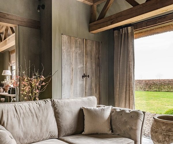
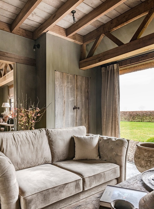
Warmer, richer tones
“Since up is now down and left is right, the one thing clients are reaching out for is the comfort of familiarity. The trend will be away from the long-lived icy and sterile gray palette. It will morph into one which is defined by the comfortable presence of natural materials. You will see gray replaced by its warmer cousins, taupe and dusty rose-brown. Inspiration will come from reference to stone, wood, brick and moss. Colors will not be high intensity but will be rich tones mimicking those found in nature. The strongest color you might see will be a dusty plum or red madder, but these will be quite muted. A low-contrast use of color, nothing jarring, will be the approach taken to decorating.” —Beverly Ferguson, ASID Allied Member, designer/principal, The Reflective Designer, Stow, MA
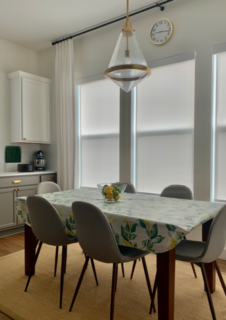
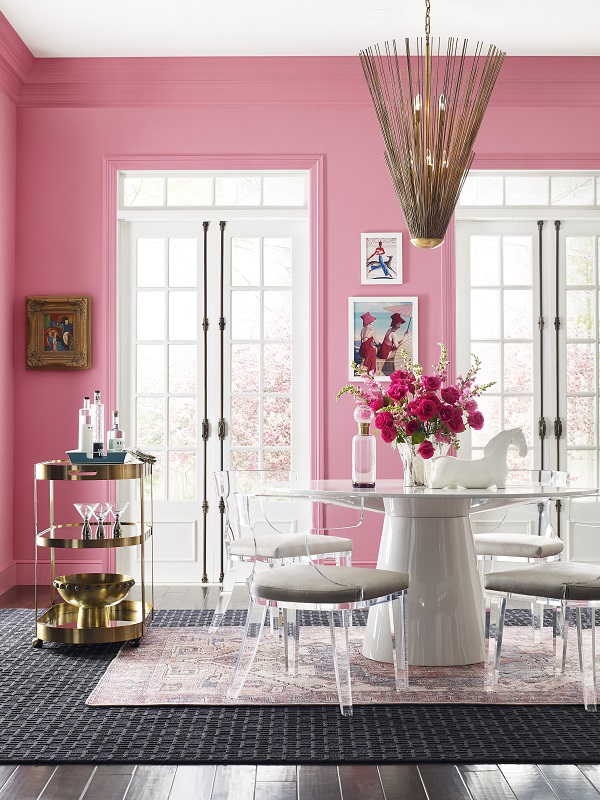
Plant-inspired greens
“We are using a lot more green in our projects lately: emerald green, hunter green, sage green. With this new trend toward bringing the outdoors in by mixing natural elements in interior spaces, greenery and fabrics in any shade of green work so well. At New South Home, we are traditionally huge fans of any shade of blue, but green is our 2021 favorite!” —Melissa Lee, principal designer and CEO, New South Home, Charlotte, NC
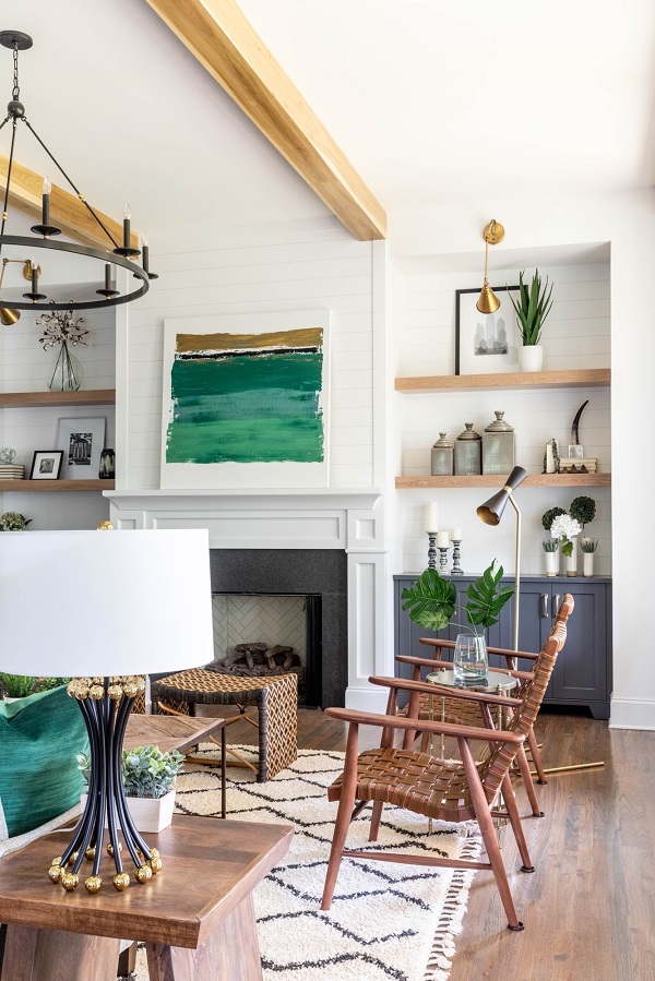
“Green has so many ranges. It can be more read as a neutral or really loud and bold. Either way, it makes such a beautiful statement in a room. Our 100 percent linen draperies in Agave really bring this crisp white room to life.” —Haley Weidenbaum, founder, Everhem, Los Angeles
Vibrant, happy shades
“With the world feeling more uncertain and tumultuous by the day, people are turning to vibrant shades pulled from nature to uplift and ground their homes. We’ll see a move toward brighter colors that make our homes feel happy. Blue’d Up is a spellbinding, violet-blue hue that pairs well with a variety of other colors and has an almost chameleonlike effect. It can sway the vibe from tranquil to cheery depending on the light and furniture in your space.” —Nicole Gibbons, founder, Clare, New York
“The theme of this year’s ColorMix Forecast celebrates the ‘Rhythm of Color.’ It focuses on bringing balance after a tumultuous year. For many people, 2020 brought out a desire for creative expression. That was the top influence in our Tapestry palette. The happy and modern hues are meant to signal joy and layer together to tell a story through texture and pattern. Additional influences, such as security, reinvented classics and sensory exploration, can be found in standout, vibrant colors like Jaipur Pink SW 6577, Alexandrite SW 0060 and Perfect Periwinkle SW 9065.” —Sue Wadden, director of color marketing, Sherwin-Williams, Cleveland
Cottagecore
“Cottagecore is a design style inspired by nostalgia for a simpler, agrarian lifestyle. We have seen its growth during the COVID epidemic as so many people are quarantined in their homes. This style builds on farmhouse décor, with white as a foundation color and splashes of earthy neutrals and colors such as greens, tans and browns—anything you would see in nature, which is pretty colorful. In the last couple of months, we have frequently seen the word “cottage” in our customer visions for their color consults. Homeowners are looking for serene, warm and comfortable decor since they are stuck at home.” —Michelle Marceny, founder, The Color Concierge, Denver, CO