
![]()
Logo updates are serious business.
If you’ve had the same logo for years—or possibly even decades—then we’re talking about a truly valuable business asset.
Steeped in daily use and potentially sprinkled all over signs, trucks, letterhead, print ads and your customers’ minds, the instant recognition that your logo provides is literally worth money.
This is why, as a branding agency, we do not take changes to logo designs lightly. And, very often, we recommend a surgical, specific approach.
Scorched earth or a light makeover?
Because the recognition factor and physical presence of a logo are such a big deal, it’s important to keep what you can and—sometimes—just update the elements that aren’t working.
- If the logo feels high-end and recognizable, but it’s illegible at tiny sizes…
- If the logo is working in most ways, but it relies on tiny illustrative details and can’t be used on glass or embroidered…
- If it looks clear at any size, but the whole thing feels homemade and therefore not trustworthy…
- If there are any issues with your current logo…
It may be time for a refresh.
So is it time for a small update, a complete overhaul…or a celebration of your existing logo with some new stickers and T-shirts? Answer the questions below to find out.
1: Is your logo a literal depiction of what you do?
The ideal answer is no. It’s very rare for a large, successful company to have a literal depiction of what they do in the logo.

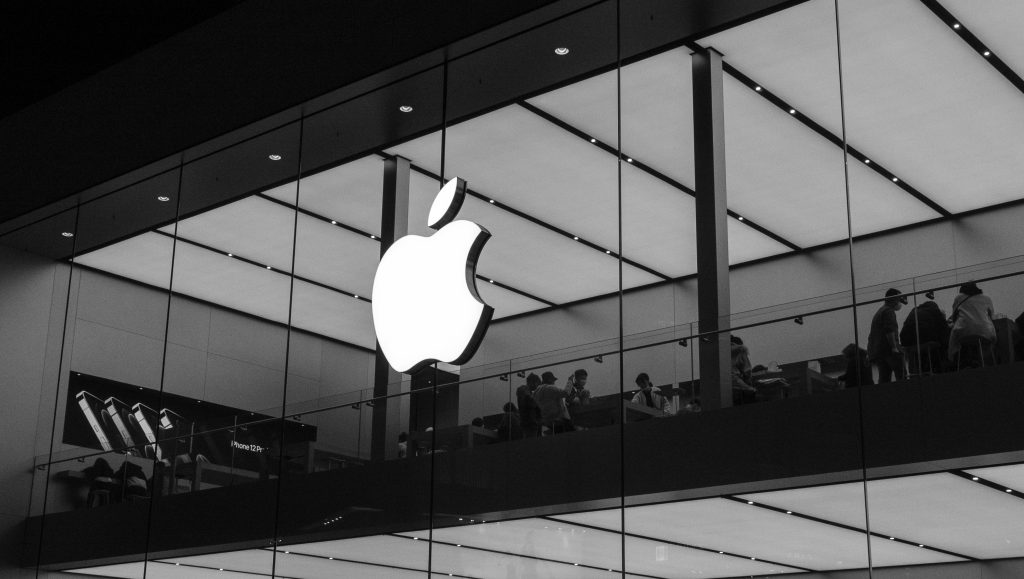
Nike has a swoosh—not an illustration of a sneaker or clothing. Apple has an apple—not a computer, a phone or a watch. Kelly Wearstler’s logo certainly doesn’t include a room or a chair.
Yes, it’s possible to have drapes on a logo for a window treatment company…but it’s tricky to make it feel truly elegant and clean. If you pay attention to logos in the world, you’ll notice that they almost never attempt to illustrate what the company does.
If this is the case for your logo and the overall effect is less upscale than you would like, consider a new visual element or the omission of anything literal while keeping everything else—the styling of the letters, the colors, etc. Sometimes removing or streamlining an element can make all the difference.
2: Is it simple enough to etch on glass?
If your logo is relying on watercolor or complex illustration to keep it memorable, it may need a tweak. All great logos—the ones that function well and stand the test of time—are made of clean, simple shapes.
If what’s memorable about your logo is a painterly texture or faux gold shine, consider taking a second look at the actual design. Does it still work in black and white? If so, you’re fine. If not, it may be time to simplify and refine.
3: Is your logo on par with other brands that your customers trust?
To put it in the most loose but accurate way, is the vibe right? Does it feel as trustworthy as other logos that your customer encounters every day? Other brands they use and love?
Literally check in with your clients or just take a look around their homes. What other brands do you see? What kinds of logos do those brands have? Get inspired.
4: Do you have at least two versions of it?
What works on your website—in many cases, a more horizontal version of your logo—might be terribly awkward in a square on social media. And having a simple icon version of your logo can be absolutely lovely in the right context.
Long story short: A business needs options. You may want versions in multiple colors from your palette or an all-white version to use on dark backgrounds. You may want two different shapes—for example, square and rectangular. You may want to use a simplified icon at the top of a thank you card.
If you only have one version of your logo, it’s not too late. Go back to your designer (or find a new one!) to create additional variations on whatever you currently have.
5: Does it stand out from your competitors?
Begin by listing three of your main competitors or, if you can’t easily bring them to mind, do an online search for “(your location) + (your service)” and see who comes up.
Take a look at their websites and ask yourself: Does your logo stand out from theirs? Is it different enough?
If there are too many similarities, it’s time for an update.
Your logo has one very important job.
It’s the key that helps people to identify your brand in any context—print, website, social media, yard sign, business card, billboard or blimp.
Essentially, it’s a mental shortcut that helps current, past and potential clients to instantly understand who you are and start thinking about everything else that they associate with the brand.
An iconic logo doesn’t need to explain what kind of services you offer or have a hidden meaning. It just needs to be appealing, scalable, simple and memorable.
And if it’s not? It may be time for a little update.