
Philadelphia-based interior designer Maria Viola-Kuttruff of Viola Interior Design came to interior design after working as a writer and editor for an insurance company. It was a strange twist of events that made her realize how much she enjoyed creating enjoyable and beautiful spaces.
It was after assisting her sister with dressing a television commercial set that Viola-Kuttruff went all in with interior design. She received her master’s degree in architecture and design from Drexel University and began her career as an interior designer for two architectural firms. In 2011, Viola-Kuttruff opened Viola Interior Designs and hasn’t looked back. She currently has three employees and primarily does residential interior projects.
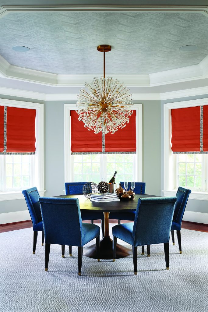
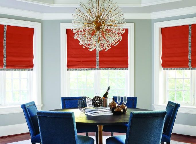
The home in which the breakfast area appears on the cover of this month’s VISION magazine is from a very traditional large residence on the Main Line, Philadelphia’s historical suburb. The new owners moved to Philadelphia from Australia. The lady of the house wanted to create an environment for her young family that reflected her chic sense of style, cosmopolitan mindset and fashionable sensibility.
The octagon-shaped breakfast area with its step design is the focal point of the family room and kitchen area, which can be seen as you enter the home. Originally, this room was very dark with dark floors, a dark old-fashioned floor rug and heavy drapery. The goal was to lighten up the space and provide a space that can endure the family’s frequent use and wear and tear but also had personality. The client wasn’t afraid of color, but she didn’t want anything that was too fussy.
Viola-Kuttruff knew she wanted to create dramatic and dynamic window treatments, but she was challenged because all the windows but two were glass doors to the outside and the others didn’t go all the way to the floor. The selected style of shades also couldn’t be too feminine, so a classic roman shade style was chosen.
With the floors redone and lightened to a more brownish color, Viola-Kuttruff knew that the room wouldn’t have too much in it so she could use dramatic pops of color—like the blue chenille upholstered chairs and the window treatments.
“The window treatments are so important,” said Viola-Kuttruff. “They are what completes the room. If you don’t do window treatments, the room looks unfinished. The shades and drapery can enhance the design. Especially when in a residential space window treatments aren’t used, it makes it seem like the person living in the house is renting and this isn’t their permanent home.”
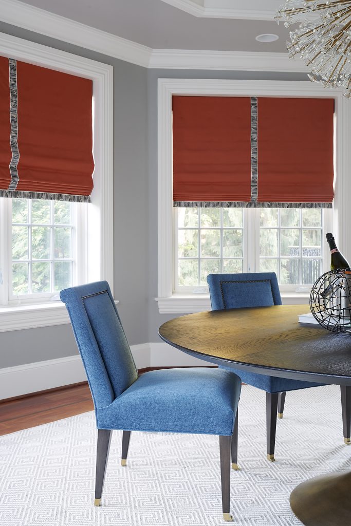
Photo – copyright Rebecca McAlpin
She continued: “Window treatments complete the look. Without them, it is like wearing a beautiful dress but not having the right shoes. You are leaving out an important part of the outfit. But the right shoes really make the outfit. Window treatments create the home’s atmosphere.”
The room’s walls were painted a neutral gray with a lighter shade on the ceiling where the middle of the ceiling was covered with a herringbone wallpaper. The Visual Comfort Dickinson Chandelier by Kate Spade New York was a very dramatic choice for this room. It has brass metal rods with dandelion-like crystals and additional geometric crystals at the end of the rods. It sets the scene for a very chic and stylish space.
The area rug was custom-made and custom-cut because it had to be shaped to include angles. And, because it was necessary to cut the rug with angles, a geometric pattern was selected because the pattern could be lined up properly to make the cuts so the rug had a complete and balanced design and appearance.
For the breakfast area, Viola-Kuttruff selected the colors orange and blue because she likes to mix hues that also complement each other. “I definitely think people are becoming more open to using color,” she said. “You don’t have to blanket a room in color, but we can introduce more saturated hues, even though people will never stop using neutrals. I think things have been very serious over the past few years and people are looking for bursts of joy and color, which is a great way to create happy spaces that make people feel good.”