
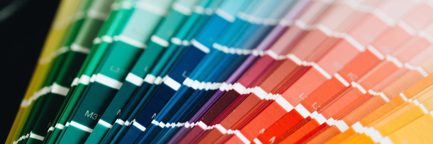
Quite literally, color signifies life. Its presence is a necessity. You can change your style each day via your clothing, but what you choose for your home seems permanent and it doesn’t have to be. Over the years, brands have taken notice of homeowners’ interest in color, adding more colorways to their offerings and even custom options.
Color’s presence has long been proven to affect a person’s mood and energy level, but, further, certain shades can change one’s experience of a room. Your designer or decorator—as well as yourself—should think about the function of each room and what emotion(s) you’d like to feel before choosing a particular hue.
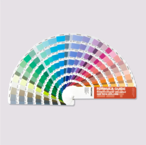
If you’re looking to make a major change, a color expert might come in handy to help you understand the psychology behind each hue. Leatrice Eiseman, a color expert and the executive director of the Pantone Color Institute, has built a career on educating individuals and brands on the context of color. She utilizes her years of practical experience, complemented by research, to inform her decisions, undoubtedly one of the many reasons Pantone has trusted her for more than 38 years.
The connection between color and psychology was documented as far back as 1810, when Johann Wolfgang von Goethe took note and penned “Theory of Colors.” More philosophy than scientific, he based his ideas on personal observation of color’s phenomena. Yellow “carries with it the nature of brightness,” red “conveys an impression of gravity and dignity” and blue “has a peculiar and almost indescribable effect on the eye.” His most powerful statement? “Colors are light’s suffering and joy.”
THINK PINK
Pink has always been a favorite for interior designers, but the “Barbie” movie reignited the flame (fanned briefly in 2008 when “Barbie Pink” became an official Pantone color). While the hue has continued to grow in popularity—millennial pink began trending around 2014—we’re finally breaking free from the conceit that it’s for girls only. Some of the words associated with pink are genderless, playful and powerful, according to Sherwin-Williams’ director of color marketing Sue Wadden.
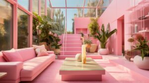
The 1950s used it as a pop of color in a postwar landscape, with pink making its way onto kitchen appliances, draperies and cosmetics. As the times changed, so did homeowners’ tastes. The late ’70s and early ’80s saw a rosy renaissance in bright shades, similar to the doll herself. According to Kim Culmone, senior vice president and head of Barbie and fashion doll design at Mattel, “The world truly made the pink connection with Barbie in the ’70s when we started consistently leaning into predominantly pink packaging as a core brand identifier.”
In 2019, Eiseman told Apartment Therapy, “There is more pink paint used in interiors now than ever historically.” A major example of this is Barbie’s (albeit impractical) Dreamhouse. To create the multi-hued pink set for Greta Gerwig’s movie, she chose the perfect shade from Rosco and exhausted the company’s supply.
“I wanted to capture what was so ridiculously fun about the Dreamhouses … I wanted the pinks to be very bright.” – Greta Gerwig in Architectural Digest
OUTSIDE THE BOX
With the pandemic in the rearview mirror, many people are going back into an office for days in a row, missing out on their home setups specially designed to give them the best working conditions. Natural light is forgotten for fluorescent fixtures, backyards are swapped out for cubicles.
For her clients, Eiseman has devised a simple way to bring the look and feel of a window treatment into a small or windowless space. Grab a print of a window, stained glass or an outdoor scene, mount it on a wall, and put a real window covering over it. “What better way to get the look of nature into the cubicle than to create a window … You can put flowers on the sill.”
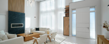
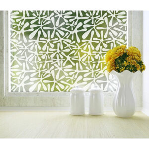
On the home front, a quick trick to let in natural light and add color is with window film. With a simple application process, this type of treatment provides benefits beyond appearance. Express yourself while increasing privacy, reduce glare and block the sun’s UV rays.
ACCENT MARKS
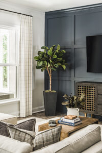
Another creative way to decorate a space and highlight a unique aspect in your home is with an accent wall. Eiseman said, “One of the least expensive things to do now is to repaint at least one wall, if not all four walls, to freshen up the atmosphere … You buy a can of paint and a little bit of grunt labor and you’ve got a new atmosphere in the room that feels fresh and new.”
If you’re not ready to commit to an entire wall, why not try out your new favorite color on a window frame? Or go for something not so permanent like throw pillows or curtains. It’s all about finding what you’re comfortable with and turning your home into an extension of your personality.
DO IT YOURSELF
Social media has become so much more than it was pre-pandemic. People turn to Instagram and Tiktok for not only the latest in interior design, but to see what these trends looks like in others’ homes before taking the plunge themselves. Doing it yourself has never been more user-friendly—and attainable—than today, plus there’s an account out there for everyone’s tastes, whether they be dark tones or rainbow schemes.
FOR FUTURE REFERENCE
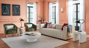
As 2023 approaches its end, what can we expect from next year’s trends? We look to three of the industry’s leading color forecasters to do just that. Behr selected Cracked Pepper as its 2024 Color of the Year. After noticing that the shade was a top seller last year, on top of survey results showing that two-thirds of American homeowner respondents felt that using a black paint made an interior feel bold, it was a clear choice.
Sherwin-Williams has decided to switch up its annual color trend report by introducing the Colormix Forecast 2024, Anthology: Volume One. The company plans on alternating the color reference each year with its usual style and trend story. The first collection explores four chromatic families: blues and greens, reds and purples, deep and dark tones, and whites and tints. Along with starting a new system, SW revealed its 2024 Color of the Year as Persimmon.
In July, Eiseman and her colleague at Pantone, vice president of the Color Institute Laurie Pressman, along with the rest of the team, announced the most popular color families of the next decade and the addition of colors to its Formula Guide. Pressman told digital-only magazine Print: “Whenever we add new colors, it is always with our design community clients in mind. Color direction is influenced by many elements including demographics, geographical location, climate, new lifestyles and play styles, and cultural and social influences. Influences may also stem from new technologies, materials, textures and effects that impact color.”
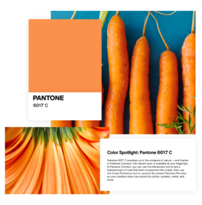
In Pantone’s research, it found a desire for spicier and deeper shades of orange and luxurious neutrals in the brown family. Purple continued its reign as a favorite and green’s popularity hasn’t waned as the focus on environment and health has continued, sparking the Color Institute to add more shades to the Formula Guide.
Color as a concept is timeless, but how you choose to incorporate it into your life is what changes. Never be afraid to experiment, that’s one of the perks of being a homeowner!