
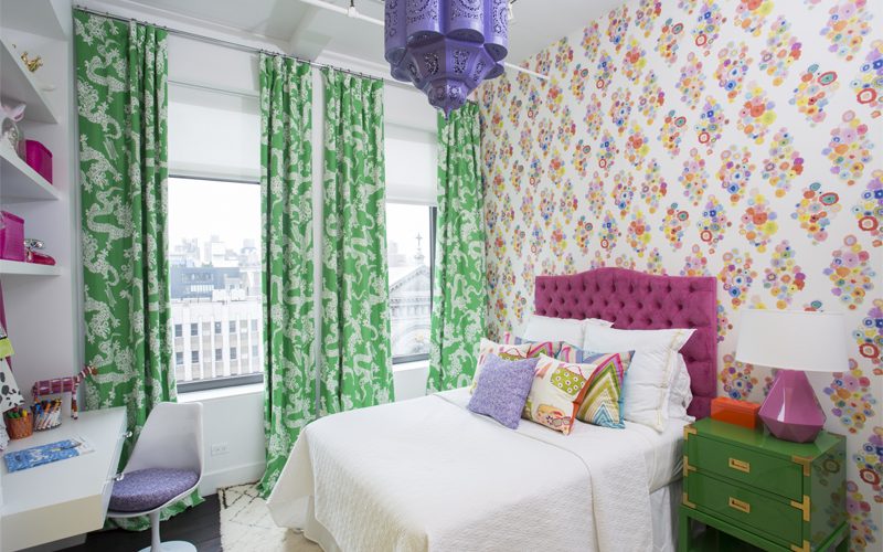
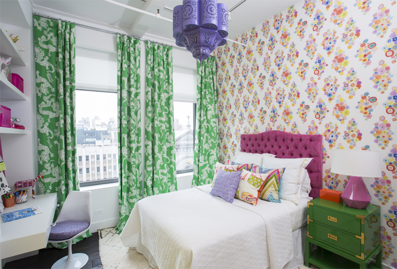
A girl’s bedroom in the Flatiron District designed by Rayman Boozer. The curtain fabric is Lily Pulitzer from Lee Jofa. The wallpaper is by Flat Vernacular, and the headboard and pillows are custom-made.
In 1998, Time Out New York called Rayman Boozer with Apartment 48 Interior Design the city’s “go-to designer for color consulting.” It was yet another jewel in the crown of this widely recognized New York-based designer, whose colorful aesthetic has won him legions of fans over the past 20 years.
Whether he’s working on spaces that are residential or commercial, big or small, urban or rural, Boozer says window coverings are a requirement. “They’re more romantic. This is always what I thought I’d do as a decorator,” he says. His favorite type of room to design is a little girl’s bedroom because it’s an excuse to do colorful curtains that puddle nicely. But he’s equally as comfortable specifying motorized shades and shutters—something that provides much-needed convenience to people living in high-ceilinged city apartments.
Given his location, Boozer works on as many studios and small offices as he does lofts and corporate headquarters. “Small spaces are more difficult,” he acknowledges, but he’s developed ways to make sure his tiny spaces satisfy clients in the same way as more grandiose homes. As is true of the very personal process of picking colors, much comes down to good communication.
The Path to Fame
Boozer grew up on a chicken farm in Indiana. Nothing about it fit his personality; he was much happier redecorating his room and reading design magazines than traipsing through dirt and muck at all hours. He also felt isolated in his small town and spent much of his time dreaming about a life in New York City.
After high school, he went to Indiana University intending to study psychology. Then he took a seminar on interior design. “Once I discovered that class… It seemed to make sense to me. You know how when math makes sense and you finally get it? It was like that. It was a similar feeling, that I really understood this process.”
Five days after Boozer graduated, he moved to New York City. “I was really in a hurry to get here and do something exciting and glamorous,” he says. But as is the case with so many people who head to the city with stars in their eyes, fame and fortune didn’t come immediately. “I was such a big deal at my school and everyone thought I was a really good designer. But I came here and there were so many other people who were good at things, so there was a lot more competition here than in Indiana.” His first job was working the retail floor at Bloomingdale’s. After that, he held similar positions at Saks Fifth Avenue and Macy’s.
His first New York dream came true when he took a job in merchandising for The Conran Shop. Terrance Conran, who was known for his groundbreaking Habitat stores in Europe, was someone Boozer had always looked up to. After several years there, he took what he had learned and opened his own home furnishing and accessory store, called Apartment 48. Interior design was his side hustle.
His big break in that field came in 2007, when his apartment was featured on cover of Elle Décor. He was flooded with requests from people who liked his colorful spaces and sense of style. In 2010, he closed the store and became a full-time designer.
“Color Is Emotion”
Color is omnipresent in Boozer’s work. “My philosophy is to surround yourself with colors you love,” he says. However, he’s also critically aware of the importance of approaching color carefully. “Color is emotion and that’s why people like it. That’s also why people are afraid to try color. It’s a commitment and most people don’t know what they want until they see it. That’s why HGTV shows are effective. People don’t know what a space will look like until they see it.”
One of the early things Boozer does with clients is get a sense of their color preferences. He’ll ask what colors they surround themselves with or what colors they regularly wear. To convey his initial ideas and thoughts, Boozer uses mood boards instead of sketches, which he believes are too hard for people to visualize.
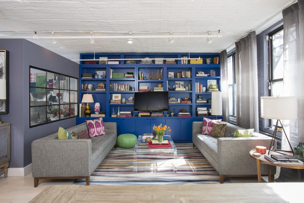
One thing that almost always makes its way into Boozer’s designs is some shade of blue. “It’s my base color,” he says. “I try to balance those colors out with lots of others, though.” Purple is one of his favorite shades to put with blue, a combination his clients once found strange but have been more comfortable with in recent years. (See “Snapshot” at the end for more of Boozer’s thoughts on color.)
Size Matters
Boozer serves a combination of residential and commercial clients. Most are in Manhattan, although he’s done some homes in Long Island, New Jersey and Connecticut. Given his location, he works on plenty of small spaces, which he says has its own set of challenges.
“In a large house, you can use a lot of different ideas, so every idea doesn’t have to land perfectly,” he says. “If you’re doing a small space, especially a studio, everything has to be flawless. If people don’t love the room you’ve designed, they can’t go into a different room.”
With these clients, communication becomes ultra-important. Boozer does his best to assess whether a client’s professed favorite color is something to invest in full-bore or something to add in small quantities, so they don’t burn out on it. He’ll often suggest that people add small touches through pillows or other accessories before making a bigger commitment.
“I’m all for putting a lot of color on the walls,” he says. “If you’re talking about paint and you think you like a color, I’d go a little lighter than the color on the sample, because it’s always going to read darker when it’s bouncing off the walls.” That’s especially true if the walls are in close proximity to each other.
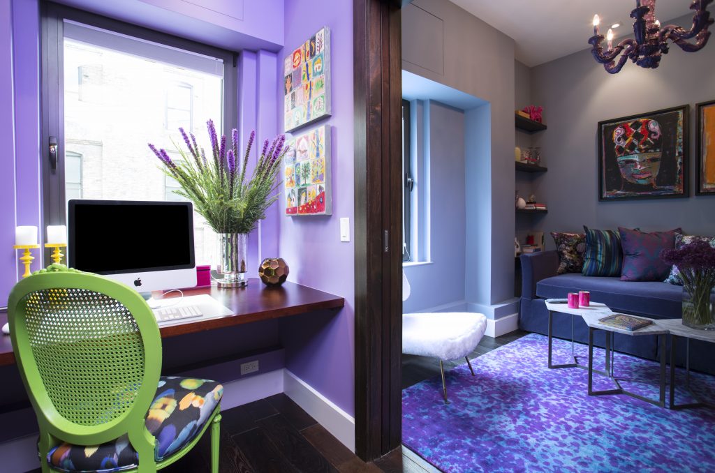
A den and home office in a New York loft. Deep purple walls set the tone, and a custom rug by ABC Carpet echoes the monochrome theme.
Daring Draperies and Subtle Shades
Window coverings are another place where color makes an appearance in Boozer’s spaces. “For window coverings, I rarely use a solid color unless it’s for a specific reason. I’ll do solid, bright colors on their own, maybe, or a subtle pattern, or white with a pattern on top.”
Although he typically specifies curtains that are silk or cotton, he believes velvet can be amazing in the right situation. “Velvet is everywhere right now,” he observes. “It got affordable, and with tech there’s so many blends that don’t wrinkle anymore. You can crush them and they bounce right back.”
Boozer is also a big believer in shades. In New York, bamboo shades are coming back into style in a big way. “It feels organic and a lot people are reacting to that organic vibe.” In addition, he says, “We use roman shades a lot in high-rise buildings because there’s always some kind of HVAC and you can’t go all the way to the floor,” he says. Many of those shades are motorized.
“In the future probably everybody’s going to want that, once it becomes more affordable,” he says. “It’s still expensive, but it’s convenient, especially if your ceilings are 11 feet.”
Snapshot: Rayman Boozer’s Color Trends
Green: “The biggest trend I’ve seen that’s surprised me is green.” As people strive for a more organic look and put more plants in their homes, this color continues to explode in popularity.
Purple: “Purple is the one color my clients have always had a problem with, but it’s a color people are embracing now.”
Pink: “It’s been around for like five years and I don’t think it’s ever going away.”
Gray: Pair this neutral with green or purple for an on-trend look.
Unusual color combinations: “What we’re seeing now is color combinations we didn’t used to see, like blue and fuchsia or red and pink.”
Black and white: “Black and white never goes out of style; that’s always a trend.”