

Oh color (or colour if you are one of our international readers), how I love you! Have you ever seen an online video when a color-blind person receives a special pair of glasses to see color for the very first time? I cry every time! Imagine living in a world devoid of color. The desire to experience the joy of finding the perfect color lipstick, arranging a window box with the perfect colors or creating the best color palette for a beautiful room is almost primal. We want to strike a visual, emotional and functional chord while creating a beautiful room.
But my idea of beautiful may not be yours. For the past 43 years, I have immersed myself in the art of color selection. I learned early on that we might disagree on what makes a perfect color palette, but we all agree that color is powerful. By simply understanding color, the chances of making a mistake when creating a beautiful room are minimized. The paint you choose should satisfy your clients, that’s the main goal. And, of course, the paint used should be lead-free (you can take EPA Lead Paint Certification course to learn more) according to government standards.
Let’s look at some of my most important color tips. To help you visualize my tips, I reached out to a few of my designer friends to demonstrate color done right.
Cross the Color Wheel
Combining warm and cool colors is an instant way to add pizzazz to a room. Rachel of Rachel Moriarty Interiors did that when she designed these roman shades (above) with a beautiful Kate Spade fabric. This combination of red-orange (coral) and blue-green (teal) allows each color a claim to fame. When crossing the wheel, one color should always be dominant. Another smart color trick is to reverse the dominant color in the rug and window treatments.
Create Contrast
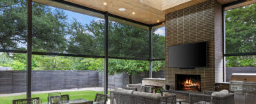
Your eye is drawn to transitions in color value. The contrast of the light fabric against the dark walls creates vertical balance by pulling the eye up. Contrast adds drama and size and draws attention to selling features when staging.
Out and Up!

The trend today is neutral palettes with “pops” of color, particularly when staging. The reality is this will visually shrink a room. Your eye is drawn to the contrast of the pop, which is often sofa pillows in the middle of the room. If your eye is brought to the center you just made the room seem smaller.
To maximize the illusion of space, bring color out to the perimeter and up the wall. In this fabulous room by Christine of Christine Kohut Interiors, the color was used in the rug and then brought out to the perimeter and up the wall in the banding on the window treatments. The result is great vertical balance created with color.
White Walls Still On-Trend… With a Twist
The trend of white on white has been around a while and is one that many still embrace. The problem is this color story can start to look boring. My suggestion is to use white as the canvas and then add color with the accessories.
Be sure to select the right white for your space. Remember whites are rarely truly neutral. Somewhere in their DNA lurks color, which may show its face at the most inopportune times. Look for whites that best complement the rest of the furnishings.
This beautiful room by Magda Dubovecak of Reimagine Interiors began with white walls. Then she selected an Anthropologie wallcovering for a creative art application. She had her installer (code word for husband) cut the mural into three pieces and mount it on frames. Whenever you can come up with an idea where your client can’t shop the price, it is a win. Creativity can always help you make money.

Yes, Virginia, Neutrals Need Appreciation Also
Color isn’t just about vibrancy… after all, most neutrals are simply a desaturated version of a color. Their chromatic nature comes out when you compare them to other paint strips or textiles. Suddenly a gray looks violet or green. Just like you might show some characteristics from your ancestors, a “neutral” may show a color when it goes on a wall that you didn’t notice originally.
Saturation is the emotional component of a space. By manipulating it, you can make a space feel energetic or calm. We each will have a natural affinity to a level of saturation. Understand that and you are halfway there.
When working with a neutral palette, add texture to keep it interesting. Texture is felt twice-with your eyes and hands. Lori Murphy of Element One Staging and Redesign nailed this concept in this staged property. Don’t you want to bury your feet in the rug or at least reach out and touch those pillows?

Jody of Jody Sokol Design added interest with textured shades, coordinated pillows and accessories. Jody also gave this room longevity by blending today’s trendy gray with classic honey tones. The gray works beautifully because it also has warmth.

Create a Color Thread and Continuity

Dictate the eye path by connecting spaces with a color thread. Do this by establishing the key color then adding other colors in connected spaces for interest. Don’t just count on paint for color-get creative. This beautiful yotel (youth hotel) in Cape Town, South Africa personifies the power of a color thread. Yvonne Kramer of Jade and Ginja said this 80-room project took two years from concept to completion. Every space has a fun and energetic vibe. It may be yotel, but it could be an oldtel because this old decorator would love to spend some time there.